► Japanese
► DARTS of the Month
Scientific Data Sonification Project
The usual way of investigating scientific satellite would be, plotting the data on the graph to visualize for confirming the data contents.
But please imagine how we should do if we could not see any graph?
Aim to create an environment to share the latest scientific data for analyzing space with people who have visual impairments, we are promoting "Scientific Data Sonification Project".
This is a joint project of Uno Laboratory in Nihon Fukushi University and CENTER for PLAnning and INformation Systems in JAXA/ISAS.
Here is some examples of our sonification.
- light curve
- spectrum
In fig.1 is a light curve of a pulsar "Cen X-3" based on pulse 4.8 sec period.
Pulsar has a feature that periodical fluctuation in the intensity of X-ray is observed when its magnetic pole of rapidly-spinning neutron star leans toward the Earth.
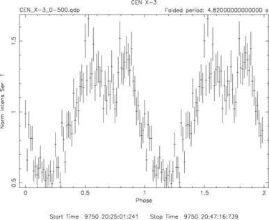
Fig.1: X-ray light curve of a pulsar observed with ASCA
Fig 1 is a light curve of pulsar X-ray in period of 4.8 sec.
This is a sonification data of Fig 1.In Fig.1, X-axis is a sound duration time, and Y-axis (X-ray intensity) is a frequency. You can catch a 2-period-sound of periodical fluctuation.
Perhaps you might guess it is a kind of a sound of classical SF movie, but this is a real one that a science satellite had received.
The sound duration time is corresponded to actual observation time, therefore this is an actual time of 2 periodical pulses.
You may realize the universe scale when you can imagine that the-sun-sized astral body turns 2 times during this sound.
Here is another example of sonification.Fig.2 is an X-ray spectrum observed with SUZAKU.Upper panel is an actual data and a model, lower panel is its residual.
X axis is X-ray energy. Both right and left panel are based on same data, but parameters of model are difference.
In the left panel, the data and model are almost coincident and residual is also almost flat.
On the other hand, in the right panel, data and model does not match and residual is undulation.
Please contrast these two charts. Following sonification files are the data of each one is model, data and residual of Fig 1.
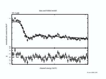
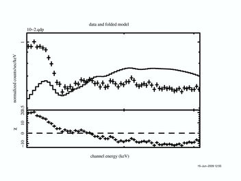
Fig.2: X-ray spectrum of Suzaku. In the left panel, data and model are almost coincident and residual is also almost flat, however in the right panel, data and model are not coincident and residual is undulation.
| LEFT panel : Sound of data : | RIGHT panel: Sound of data : |
| LEFT panel : Sound of model : | RIGHT panel: Sound of model : |
| LEFT panel : Sound of residual : | RIGHT panel: Sound of residual : |
When we are sonifing scientific data, we can catch various kinds of interesting sounds.
These sounds would be one trigger for visual impairment users to understand the scientific data.
However, our purpose is not only to make a tutorial material.
As we mentioned on the another page, it is really tough job to read out something data from the chart without any visual information.
Nevertheless there are people who want to read the chart. In some cases, they can get further profound understanding of the chart than the others.
Every time I saw such cases, I was really impressed with their glegness and I think we should share the latest science data with them.
To advance our space exploration, we should not depend on the sense of vision only, but also utilize effectively the sense of hearing,
we are sure that we would be able to catch a new sound from the space.
Nihon Fukushi University Department of Human Care Engineering
Shin'ichiro UNO
June, 2009